After completing this course, learners can pursue roles such as Data Analyst, Data Visualisation Specialist, Business Intelligence Developer, or Junior Data Scientist. It also serves as a strong foundation for advanced studies in analytics, AI, or data engineering.
Course Features
Price
Study Method
Online | Self-paced
Course Format
Reading Material - PDF, article
Duration
9 hours, 45 minutes
Qualification
No formal qualification
Certificate
At completion
Additional info
Coming soon
- Share
Overview
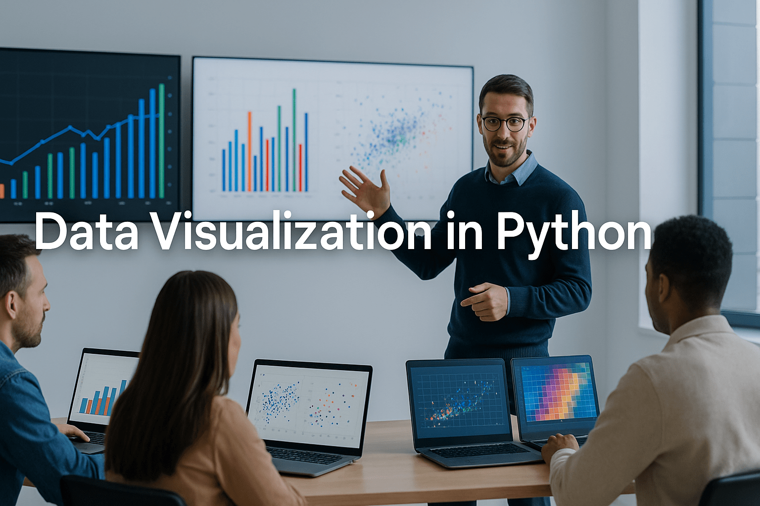
Data visualisation in Python is an essential skill for anyone who wants to transform complex data into clear, compelling insights. This course takes you on a complete journey through the most powerful Python visualisation libraries — Matplotlib, Seaborn, Pandas plotting, and Plotly — giving you hands-on experience in creating everything from simple line graphs to interactive 3D charts.
You’ll start by mastering Matplotlib, learning how to plot data, customise styles, and combine multiple charts for publication-quality visuals. Then, you’ll dive into Seaborn to explore its advanced features for statistical plotting, data relationships, and aesthetic styling. The course also covers Pandas plotting tools, allowing you to create professional charts directly from data frames, and Plotly, which brings your visuals to life through dynamic, interactive dashboards.
Each lecture is structured with real-world examples — including IMDB movie datasets and Iris flower data — to help you understand how to communicate insights effectively. You’ll also discover best practices for chart selection, colour theory, and storytelling through data, ensuring your visuals not only look good but also convey meaning clearly.
By the end of this course, you’ll be able to build high-quality, interactive dashboards and visual reports that can impress employers, clients, and stakeholders alike. You’ll develop confidence in using Python’s data visualisation ecosystem to support data analysis, business intelligence, and data science workflows.
Upon completion, you’ll receive a free course completion certificate, with options to upgrade to premium certificates and transcripts for professional use. Learners also benefit from 5-star rated support, available 24/7 through email, ensuring guidance every step of the way.
This course is ideal for aspiring data analysts, scientists, and Python developers who want to enhance their ability to communicate insights visually. It’s also perfect for business professionals and students aiming to use Python for research, presentations, and analytics storytelling.
Basic Python knowledge and familiarity with data handling using libraries like Pandas are recommended. No prior experience in data visualisation is required — all concepts are taught from the ground up using hands-on, practical examples.
Who is this course for?
Data visualisation in Python is an essential skill for anyone who wants to transform complex data into clear, compelling insights. This course takes you on a complete journey through the most powerful Python visualisation libraries — Matplotlib, Seaborn, Pandas plotting, and Plotly — giving you hands-on experience in creating everything from simple line graphs to interactive 3D charts.
You’ll start by mastering Matplotlib, learning how to plot data, customise styles, and combine multiple charts for publication-quality visuals. Then, you’ll dive into Seaborn to explore its advanced features for statistical plotting, data relationships, and aesthetic styling. The course also covers Pandas plotting tools, allowing you to create professional charts directly from data frames, and Plotly, which brings your visuals to life through dynamic, interactive dashboards.
Each lecture is structured with real-world examples — including IMDB movie datasets and Iris flower data — to help you understand how to communicate insights effectively. You’ll also discover best practices for chart selection, colour theory, and storytelling through data, ensuring your visuals not only look good but also convey meaning clearly.
By the end of this course, you’ll be able to build high-quality, interactive dashboards and visual reports that can impress employers, clients, and stakeholders alike. You’ll develop confidence in using Python’s data visualisation ecosystem to support data analysis, business intelligence, and data science workflows.
Upon completion, you’ll receive a free course completion certificate, with options to upgrade to premium certificates and transcripts for professional use. Learners also benefit from 5-star rated support, available 24/7 through email, ensuring guidance every step of the way.
This course is ideal for aspiring data analysts, scientists, and Python developers who want to enhance their ability to communicate insights visually. It’s also perfect for business professionals and students aiming to use Python for research, presentations, and analytics storytelling.
Basic Python knowledge and familiarity with data handling using libraries like Pandas are recommended. No prior experience in data visualisation is required — all concepts are taught from the ground up using hands-on, practical examples.
After completing this course, learners can pursue roles such as Data Analyst, Data Visualisation Specialist, Business Intelligence Developer, or Junior Data Scientist. It also serves as a strong foundation for advanced studies in analytics, AI, or data engineering.
Requirements
Data visualisation in Python is an essential skill for anyone who wants to transform complex data into clear, compelling insights. This course takes you on a complete journey through the most powerful Python visualisation libraries — Matplotlib, Seaborn, Pandas plotting, and Plotly — giving you hands-on experience in creating everything from simple line graphs to interactive 3D charts.
You’ll start by mastering Matplotlib, learning how to plot data, customise styles, and combine multiple charts for publication-quality visuals. Then, you’ll dive into Seaborn to explore its advanced features for statistical plotting, data relationships, and aesthetic styling. The course also covers Pandas plotting tools, allowing you to create professional charts directly from data frames, and Plotly, which brings your visuals to life through dynamic, interactive dashboards.
Each lecture is structured with real-world examples — including IMDB movie datasets and Iris flower data — to help you understand how to communicate insights effectively. You’ll also discover best practices for chart selection, colour theory, and storytelling through data, ensuring your visuals not only look good but also convey meaning clearly.
By the end of this course, you’ll be able to build high-quality, interactive dashboards and visual reports that can impress employers, clients, and stakeholders alike. You’ll develop confidence in using Python’s data visualisation ecosystem to support data analysis, business intelligence, and data science workflows.
Upon completion, you’ll receive a free course completion certificate, with options to upgrade to premium certificates and transcripts for professional use. Learners also benefit from 5-star rated support, available 24/7 through email, ensuring guidance every step of the way.
This course is ideal for aspiring data analysts, scientists, and Python developers who want to enhance their ability to communicate insights visually. It’s also perfect for business professionals and students aiming to use Python for research, presentations, and analytics storytelling.
Basic Python knowledge and familiarity with data handling using libraries like Pandas are recommended. No prior experience in data visualisation is required — all concepts are taught from the ground up using hands-on, practical examples.
After completing this course, learners can pursue roles such as Data Analyst, Data Visualisation Specialist, Business Intelligence Developer, or Junior Data Scientist. It also serves as a strong foundation for advanced studies in analytics, AI, or data engineering.
Career path
Data visualisation in Python is an essential skill for anyone who wants to transform complex data into clear, compelling insights. This course takes you on a complete journey through the most powerful Python visualisation libraries — Matplotlib, Seaborn, Pandas plotting, and Plotly — giving you hands-on experience in creating everything from simple line graphs to interactive 3D charts.
You’ll start by mastering Matplotlib, learning how to plot data, customise styles, and combine multiple charts for publication-quality visuals. Then, you’ll dive into Seaborn to explore its advanced features for statistical plotting, data relationships, and aesthetic styling. The course also covers Pandas plotting tools, allowing you to create professional charts directly from data frames, and Plotly, which brings your visuals to life through dynamic, interactive dashboards.
Each lecture is structured with real-world examples — including IMDB movie datasets and Iris flower data — to help you understand how to communicate insights effectively. You’ll also discover best practices for chart selection, colour theory, and storytelling through data, ensuring your visuals not only look good but also convey meaning clearly.
By the end of this course, you’ll be able to build high-quality, interactive dashboards and visual reports that can impress employers, clients, and stakeholders alike. You’ll develop confidence in using Python’s data visualisation ecosystem to support data analysis, business intelligence, and data science workflows.
Upon completion, you’ll receive a free course completion certificate, with options to upgrade to premium certificates and transcripts for professional use. Learners also benefit from 5-star rated support, available 24/7 through email, ensuring guidance every step of the way.
This course is ideal for aspiring data analysts, scientists, and Python developers who want to enhance their ability to communicate insights visually. It’s also perfect for business professionals and students aiming to use Python for research, presentations, and analytics storytelling.
Basic Python knowledge and familiarity with data handling using libraries like Pandas are recommended. No prior experience in data visualisation is required — all concepts are taught from the ground up using hands-on, practical examples.
After completing this course, learners can pursue roles such as Data Analyst, Data Visualisation Specialist, Business Intelligence Developer, or Junior Data Scientist. It also serves as a strong foundation for advanced studies in analytics, AI, or data engineering.
-
- Introduction to Matplotlib 00:10:00
- Creating Line Plots – Part 1 00:10:00
- IMDB Movie Revenue Plot – Part 1 00:10:00
- IMDB Movie Revenue Plot – Part 2 00:10:00
- Line Plot – Rank vs Runtime, Votes, and Metascore 00:10:00
- Line Styling and Adding Labels 00:10:00
- Scatter, Bar, and Histogram Plots – Part 1 00:10:00
- Scatter, Bar, and Histogram Plots – Part 2 00:10:00
- Subplots – Part 1 00:10:00
- Subplots – Part 2 00:10:00
- Creating Multiple Subplots 00:10:00
- Creating Zoomed Sub-Figures 00:10:00
- Axis Limits, Legends, Grids, and Ticks 00:10:00
- Pie Charts and Saving Figures 00:10:00
-
- Introduction to Seaborn 00:10:00
- Creating Scatter Plots 00:10:00
- Using Hue, Style, and Size – Part 1 00:10:00
- Using Hue, Style, and Size – Part 2 00:10:00
- Creating Line Plots – Part 1 00:10:00
- Creating Line Plots – Part 2 00:10:00
- Creating Line Plots – Part 3 00:10:00
- Subplots in Seaborn 00:10:00
- Using sns.lineplot() and sns.scatterplot() 00:10:00
- Creating Categorical Plots (catplot) 00:10:00
- Drawing Box Plots 00:10:00
- Drawing Boxen Plots 00:10:00
- Creating Violin Plots 00:10:00
- Creating Bar Plots 00:10:00
- Point Plots for Comparison 00:10:00
- Joint Plots for Bivariate Analysis 00:10:00
- Pair Plots for Dataset Overview 00:10:00
- Regression Plots for Linear Relationships 00:10:00
- Styling Seaborn Charts and Aesthetics 00:10:00
- Introduction to the IRIS Dataset 00:10:00
- Loading the IRIS Dataset in Pandas 00:10:00
- Creating Line Plots 00:10:00
- Using Secondary Axes 00:10:00
- Creating Bar and Horizontal Bar Charts 00:10:00
- Stacked Bar Plotting 00:10:00
- Drawing Histograms with Pandas 00:10:00
- Creating Box Plots 00:10:00
- Area and Scatter Plotting 00:10:00
- Creating Hexbin Plots 00:10:00
- Creating Pie Charts 00:10:00
- Scatter Matrix and Subplot Layouts 00:10:00
- Exam of Data Visualisation in Python: From Matplotlib to Plotly 00:50:00

No Reviews found for this course.
Is this certificate recognized?
Yes, our premium certificate and transcript are widely recognized and accepted by embassies worldwide, particularly by the UK embassy. This adds credibility to your qualification and enhances its value for professional and academic purposes.
I am a beginner. Is this course suitable for me?
Yes, this course is designed for learners of all levels, including beginners. The content is structured to provide step-by-step guidance, ensuring that even those with no prior experience can follow along and gain valuable knowledge.
I am a professional. Is this course suitable for me?
Yes, professionals will also benefit from this course. It covers advanced concepts, practical applications, and industry insights that can help enhance existing skills and knowledge. Whether you are looking to refine your expertise or expand your qualifications, this course provides valuable learning.
Does this course have an expiry date?
No, you have lifetime access to the course. Once enrolled, you can revisit the materials at any time as long as the course remains available. Additionally, we regularly update our content to ensure it stays relevant and up to date.
How do I claim my free certificate?
I trust you’re in good health. Your free certificate can be located in the Achievement section. The option to purchase a CPD certificate is available but entirely optional, and you may choose to skip it. Please be aware that it’s crucial to click the “Complete” button to ensure the certificate is generated, as this process is entirely automated.
Does this course have assessments and assignments?
Yes, the course includes both assessments and assignments. Your final marks will be determined by a combination of 20% from assignments and 80% from assessments. These evaluations are designed to test your understanding and ensure you have grasped the key concepts effectively.
Is this course accredited?
We are a recognized course provider with CPD, UKRLP, and AOHT membership. The logos of these accreditation bodies will be featured on your premium certificate and transcript, ensuring credibility and professional recognition.
Will I receive a certificate upon completion?
Yes, you will receive a free digital certificate automatically once you complete the course. If you would like a premium CPD-accredited certificate, either in digital or physical format, you can upgrade for a small fee.
Course Features
Price
Study Method
Online | Self-paced
Course Format
Reading Material - PDF, article
Duration
9 hours, 45 minutes
Qualification
No formal qualification
Certificate
At completion
Additional info
Coming soon
- Share
{"title":"","show_title":"0","post_type":"course","taxonomy":"","term":"0","post_ids":"","course_style":"random","featured_style":"course4","masonry":"","grid_columns":"clear1 col-md-12","column_width":"268","gutter":"30","grid_number":"3","infinite":"","pagination":"","grid_excerpt_length":"100","grid_link":"1","grid_search":"0","course_type":"","css_class":"","container_css":"","custom_css":""}

Food Science Level 8 Advanced Diploma
Course Line240£490.00Original price was: £490.00.£14.99Current price is: £14.99.Mountain Safety and Risk Management for Climbers
Course Line237£490.00Original price was: £490.00.£14.99Current price is: £14.99.Sales Funnel Mastery: The Bridge Page Sales Funnel
Kazi Shofi Uddin Bablu237£490.00Original price was: £490.00.£14.99Current price is: £14.99.


Related Courses
Computer Network Security & Ethical Hacking: From Zero to Advanced
£490.00Original price was: £490.00.£14.99Current price is: £14.99.237Software Engineering Level 8 Advanced Diploma
£490.00Original price was: £490.00.£14.99Current price is: £14.99.239Civil Engineering Building Construction Fundamentals: Site, Codes & Quantity Skills
£490.00Original price was: £490.00.£14.99Current price is: £14.99.237